Tourism in Incredible India-Manipur: The Jewelled Land

The name Manipur itself means ‘a jewelled land’ . It is a perfect destination for nature lovers. Due to its breathtaking beauty, situated amidst blue hills and green blankets, Manipur is popularly known as ‘Switzerland of India’.

The state boats of rich cultural heritage and soul captivating landscape. Culture is India’s main USP for tourism.The  lakes, dense forests, and blooming valleys make Manipur a paradise on Earth. Manipur has amazing alpine forests and is a home to nearly 500 varieties of orchids out of which 472 are identified.

In order to reach Manipur you can take flights to Imphal which is the capital and has the second largest airport in North East. The railway is in the making process for Manipur but you can take trains for Dimapur in Nagaland which is the nearest station.

Here are the top places of Manipur which are must see.

Imphal
The capital of Manipur is beatiful. Being located at the center of Manipur, it is surrounded with lush, dewy valleys and vibrant green hills.  It is the leading tourist destination in Manipur. The popular places to visit in Imphal are Loktak Lake, Red Hill Lokpaching, Kangla Fort, Sirohi National Park, Manipur State Museum, Sekta Archaeological Living Museum, Manipur Zoological Gardens, Keibul Lam Jao National Park, Jama Masjid, Shree Govindajee Temple, Khonghampat Orchidarium and Matai Garden

Loktak Lake
It is located near Moirang and is the largest freshwater lake in North East India. It is famous for the phumdis or decomposed plants floating over it. The lake dwellers live on these for real. You can tour the lake through the boating facility and can also spot exotic species of birds, flora and fauna. The lake is a source of hydropower, irrigation, and drinking water for the locals. Phumdis are great attraction of this lake.

Keibul Lamjao National Park
It is situated in Bishnupur district and is an integral part of Loktak Lake. You can spot the Brow- antlered deer or sangai, also called as dancing deer which is Manipur’s endangered species. The park has many species of Aquatic flora and other fauna. it has a unique distinction of being a floating National Park.

Churachandpur
It is a district of Manipur and the second largest town in state. The place is full of scenic beauty and cultural delight which can be observed through the lifestyle of the locals. There is boat riding facilities at Tipaimukh. The popular places to visit here are Ngaloi Falls, Tuibuong Tribal Museum, Tonglon Cave, and Khuga Dam.

Kakching
It is a town situated in Thoubal district and is 44 km from Imphal. The fresh produce of the local markets with great variety attracts tourists. The Uyok Ching which is a garden is a popular spot here.

Ukhrul
It is located 84 km from Imphal. Ukhrul is best known for its visual appeal. The elevated beauty of this place will just mesmerize you. If you are a nature fan, Ukhrul can’t be missed. The popular places to visit at Ukhrul are Khayang Peak, Shirui Kashung Peak, Kachouphung Lake, Khangkhui Cave, Shirui Kashung, Hundung Mangva Cave, Nillai Tea Estate, and Ango Ching.

Tamenglong
It is a small town which is blessed with beauty in abundance. It is situated on a hill top which and comes down to Barak River. It is a land of virgin forests consisting of rare species of flora and fauna. The top tourist attractions here are seven waterfalls across Barak River, Tharon Cave, and many small lakes.

Dzuko Valley
It is located in the Senapati district of Manipur. The panoramic view of the valley will rejuvenate your senses as you take in the greenery. It is home to the unique and rare Dzuko Lily. The cold streams flowing through the valley make it a fantasy land for tourists.

Sadu Chiru Falls
It is 20 km from Imphal and is also known as Leimaram waterfalls. The white roaring waters make this place an apt tourist destination to capture in as a memorable experience.

Manipur celebrates many festivals which are a delight if you wish to participate. The most famous ones are Ningol Chakauba, Yaoshang, KUT, Gang Ngai, Chumpha, Cheiraoba, Kang, and Heikru Hitongba.

Foreigners  now need not obtain special permits to visit Manipur; however they must register with the registration office. The permit exemption does not apply to citizens of specified countries which include Pakistan, Bangladesh and China who need to take approval from Ministry of Home Affairs.

Source(s):
Free Press

http://manipurtourism.gov.in/

Home

Posted in Class Notes, earth | Leave a comment

Migration and Its Impact on Cities : A Report

The World Economic Forum has released a report taking a deep dive on migration and cities, exploring the types, causes and patterns of migration, the most affected corridors and cities, the impact on urban infrastructure and services, the solutions that can be employed and how cities can seek to future-proof themselves to address this growing challenge.

The report captures the migration stories of 22 of the most affected cities around the world, including from North America (Montreal, Ottawa, Calgary, New York and Boston), Latin America (Sao Paulo and Medellin), Middle East and North Africa (Dubai, Amman, Ramallah), Sub Saharan Africa (Cape Town and Dakar), Asia (Pune, Surat, Guangzhou and Davao City), Europe (Berlin, Athens, Paris, Amsterdam and Rotterdam) and Oceania (Auckland). The report also presents a high level framework to achieve long term migrant integration and in delivering urban infrastructure and services efficiently and effectively to meet the needs of migrants.


You can download the the report here (High resolution) or here (Low resolution).

Posted in earth, Migration | 3 Comments

The Gravity Model of Migration

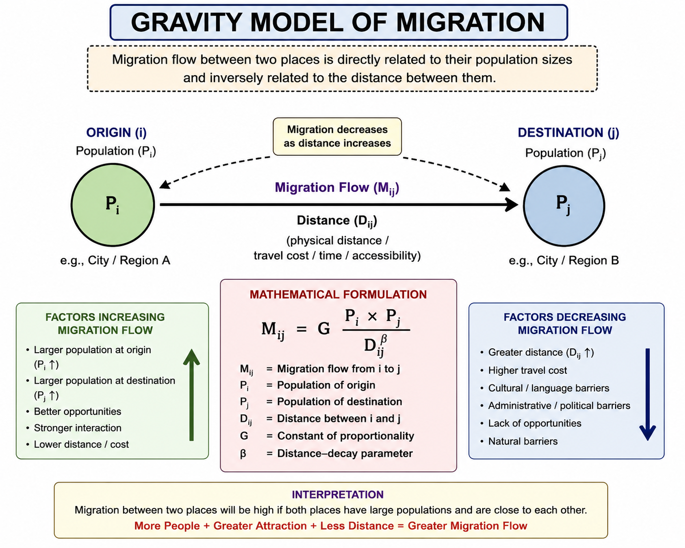
The gravity model of migration is a model in urban geography derived from Newton’s law of gravity, and used to predict the degree of interaction between two places. Newton’s law states that: “Any two bodies attract one another with a force that is proportional to the product of their masses and inversely proportional to the square of the distance between them.”

When used geographically, the words ‘bodies’ and ‘masses’ are replaced by ‘locations’ and ‘importance’ respectively, where importance can be measured in terms of population numbers, gross domestic product, or other appropriate variables. The gravity model of migration is therefore based upon the idea that as the importance of one or both of the location increases, there will also be an increase in movement between them. The farther apart the two locations are, however, the movement between them will be less. This phenomenon is known as distance decay.


The gravity model can be used to estimate:

  • Traffic flow
  • Migration between two areas
  • The number of people likely to use one central place
    It is  a model to predict movement of people, information, and commodities between cities and even continents.

The gravity model takes into account the population size of two places and their distance. Since larger places attract people, ideas, and commodities more than smaller places and places closer together have a greater attraction, the gravity model incorporates these two features.

The relative strength of a bond between two places is determined by multiplying the population of city A by the population of city B and then dividing the product by the distance between the two cities squared.

Population 1 x Population 2
_________________________

        distance²

Thus, if we compare the bond between city A and City B, we first multiply their  populations and then we divide the ressult by the distance squared Therefore, the bond between New York and Los Angeles is greater than that of El Paso and Tucson!

While the gravity model was created to anticipate migration between, it can also be used to anticipate the traffic between two places, the number of telephone calls, the transportation of goods and mail, and other types of movement between places. The gravity model can also be used to compare the gravitational attraction between two continents, two countries, two states, two counties, or even two neighborhoods within the same city.

Some prefer to use the functional distance between cities instead of the actual distance. The functional distance can be the driving distance or can even be flight time between cities.

It was expanded by William J. Reilly in 1931 into Reilly’s law of retail gravitation to calculate the breaking point between two places where customers will be drawn to one or another of two competing commercial centers.

Critiques of the gravity model argue that it can not be confirmed scientifically, that it’s only based on observation. They also state that the gravity model is an unfair method of predicting movement because its biased toward historic ties and toward the largest population centers.

A Helpful Video

Source(s):

Wikipedia

Thought.co


Posted in Class Notes, earth, Migration | Leave a comment

Thematic Maps and Thematic Mapping Techniques

A thematic map is a type of map specifically designed to “show a particular theme connected with a specific geographic area.

Unlike reference maps, which tell us where something is, thematic maps tell us how something is.
There are a number of visualization techniques and thematic map types that have different applications depending on the type of data that you are exploring and the type of spatial analysis that you are looking to do. The methodology and the type of map that you want to create may be different, for example, if you are exploring global shipping data or voter propensity, or environmental disaster impact.

All thematic maps use maps with coastlines, city locations and political boundaries as their base maps. The map’s specific theme is then layered onto this base map via different mapping programs and technologies like a geographic information system (GIS).

Broad Types

Quantitative 

Choropleth: Color gradient

Chorochromatic: Various Color

Choroschematic: Shown by Symbols

Isopleth:  Lines

Proportional Symbols: Size of symbols

Dot Density Maps: Show Population

Qualitative

Qualitative thematic maps are not dependent on numbers (data). For example, One can map the hospitals in Manhattan without counting them. I may only be interested in their locations to see where the medical gaps are. Then one could layer the map with population data to determine how many people are served, theoretically, by each one—and then compare that ratio with ones for the other boroughs of New York City.Following  are some examples

  • Communication and Transportation Maps
  • Ethnography Maps
  • Linguistic Maps
  • Military History Maps
  • Urban Planning Maps

History of Thematic Maps
Thematic maps did not develop as a map type until the mid-17th Century because accurate base maps were not present prior to this time. Once they became accurate enough to display coastlines, cities and other boundaries correctly, the first thematic maps were created. In 1686 for example, Edmond Halley, an astronomer from England, developed a star chart. In that same year, he published the first meteorological chart using base maps as his reference in an article he published about trade winds. In 1701, Halley also published the first chart to show lines of magnetic variation- a thematic map that later became useful in navigation.Halley’s maps were largely used for navigation and the study of the physical environment.

 In 1854, John Snow, a doctor from London created the first thematic map used for problem analysis when he mapped cholera’s spread throughout the city. He began with a base map of London’s neighborhoods that included all streets and water pump locations. He then mapped the locations where people died from cholera on that base map and was able to find that the deaths clustered around one pump and determined that the water coming from the pump was the cause of cholera.

 In addition to these maps, the first map of Paris showing population density was developed by a French engineer named Louis-Leger Vauthier. It used isolines (a line connecting points of equal value) to show population distribution throughout the city and was believed to be the first use of isolines to display a theme that did not have to do with physical geography.

Lets take a look at some popular thematic maps and mapping techniques.

 Choropleth maps
A choropleth map is a thematic map where geographic regions are colored, shaded, or patterned in relation to a value.This type of map is particularly useful when visualizing a variable and how it changes across defined regions or geopolitical areas.

For example, a choropleth map is extremely useful when looking at vote totals by political party per county in the United States, as below. In a choropleth map, color can be used to represent distinct attributes or, as in the example below, to represent weight of a value (a strong or weak party vote-share shown as light or dark colors).

Isarithmic or Isopleth
Isarithmic maps, also known as contour maps or isopleth maps depict smooth continuous phenomena such as precipitation or elevation. Each line-bounded area on this type of map represents a region with the same value. For example, on an elevation map, each elevation line indicates an area at the listed elevation. An Isarithmic map is a planimetric graphic representation of a 3-D surface. Isarithmic mapping requires 3-D thinking for surfaces that vary spatially.

Heat maps
A heat map represents the intensity of an incident’s occurrence within a dataset. A heatmap uses color to represent intensity, though unlike a choropleth map, a heatmap does not use geographical or geo-political boundaries to group data. This technique requires point geometries, as you are looking to map the frequency of an occurrence at a specific point.

Visualizing the intensity of occurrence using a heat map is a technique commonly used when tracking weather and natural phenomena, in which established borders and boundaries are less useful for understanding impact areas. In the heat map below, drought conditions across the United States are visualized based on intensity, giving us a greater understanding of past and potential impact areas.

Proportional symbol maps
A proportional symbol map can represent data tied to a specific geographical point or data that is aggregated to a point from a wider area.

In these maps, a symbol is used to represent the data at that specific or aggregate point, and then scaled by value, so that a larger symbol represents a greater value. The size of each symbol can be proportional to the value you are visualizing or you can set 3 to 5 ‘classes’ of values allowing for comparison and classification of locations.

Dot density maps
A dot density map uses a dot to represent a feature or attribute in your data.

Some dot density maps are ‘one-to-one’ in which each dot represents a single occurrence or data point, or ‘one to many’ in which each dot represents a set of aggregated data, for example one dot may represent 100 individuals with a certain attribute. Both of these types of dot density map visualize the scatter of your data, which can provide insights into where instances of an occurrence are clustered.

Animated time-series maps
More of a technique than a type, if your data has a temporal component (taking place over time), you can transform any of the above visualizations into an animated time-series map. Looking at your data over time can both improve your ability to gain insights and create a stronger and more compelling visual.

Putting your data on an appropriate time scale will allow you to make important business decisions. Mapping foot traffic over the course of a week, for example, may inform hours of operation for a retail location while mapping and animating a century’s worth of sea level measurements can paint a vivid picture on the impact of global climate change.

With many applications from social listening to resource management to demographic projection, animating your data as a time-series map unlocks a new dimension at which to view your data.

Cartograms
A dasymetric map is an alternative to a choropleth map. As with a choropleth map, data are collected by enumeration units. But instead of mapping the data so that the region appears uniform, ancillary information is used to model internal distribution of the phenomenon. For example, population density will be much lower in forested area than urbanized area, so in a common operation, land cover data (forest, water, grassland, urbanization) may be used to model the distribution of population reported by census enumeration unit such as a tract or county.

Source(s):

Carto

Wikipedia

ThoughtCo


Posted in Class Notes, earth, Geography Practicals/Lab and Statistical Techniques | Leave a comment